Tennessee Titans Rebrand Details: New uniforms, logos, color scheme, all driven by fans, Oilers history, and Nashville roots
The Titans are entering a new era, and they’re doing so in timeless and elegant style.

The Tennessee Titans have a brand new look.
After weeks of whispers, leaks, and reports from A to Z Sports and others, we finally know what the Titans’ brand overhaul looks like. And it’s sure to get fans fired up about their next chapter. Here’s what the new Titans look like starting right now:
The Titans’ new logos
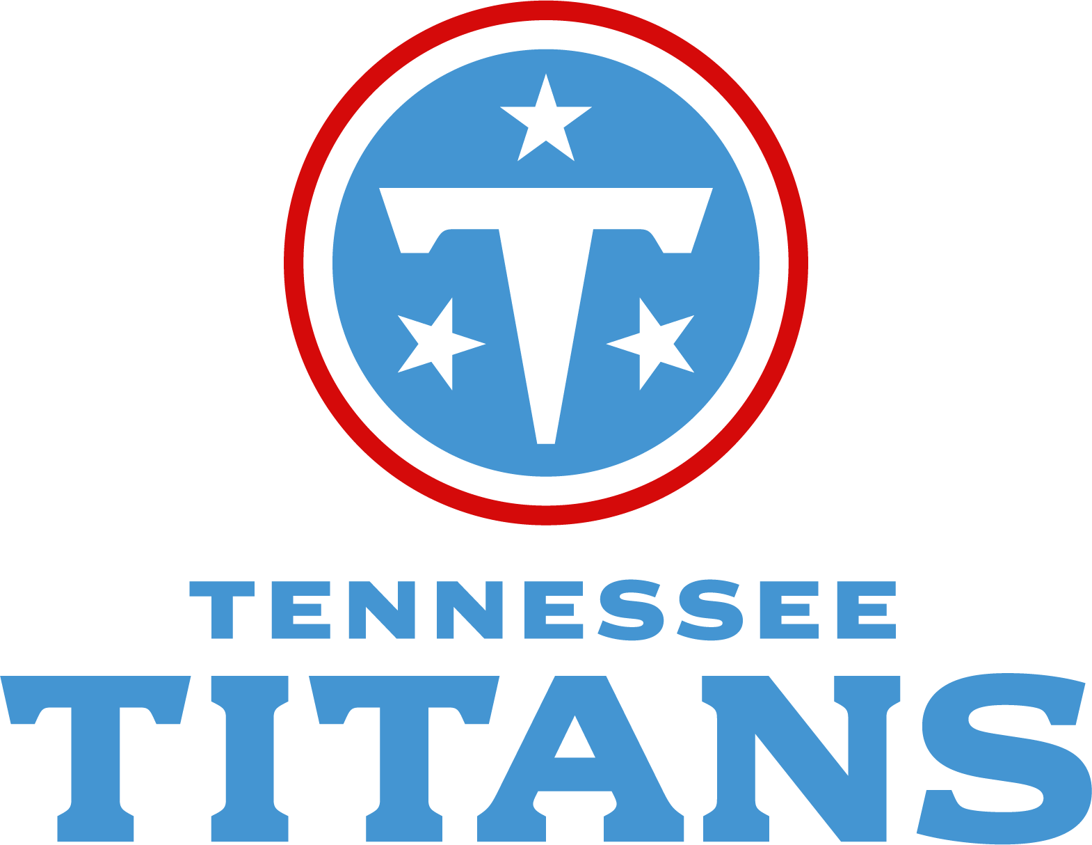
The new primary logo for the Titans is what we’ve seen since the Fanatics.com leak of the iconic plush football last month. It’s called “The Shield”, which is one of the last vestiges of explicitly Greek iconography in this brand package.
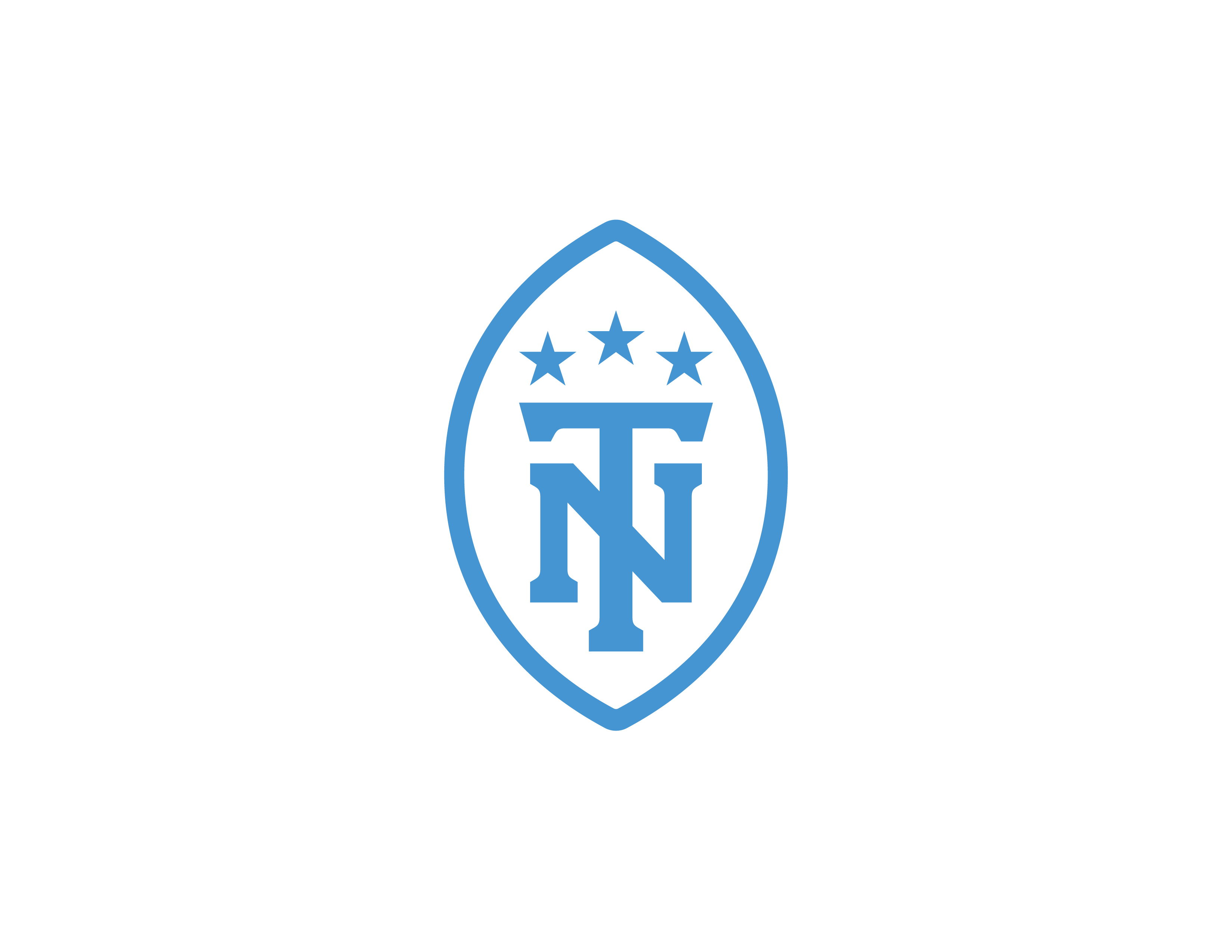
The secondary logo is one of the most new things this rebrand has to offer. It’s called “The Football”, and it has a throwback, New York Yankees feel. The all-white logo is a vertical football outline with the Tennessee state tristar atop a monogram of “NT” if you choose to read it as Nashville, Tennessee, or “TN” if you choose to read it as the abbreviation for the state. A clever double-entendre!
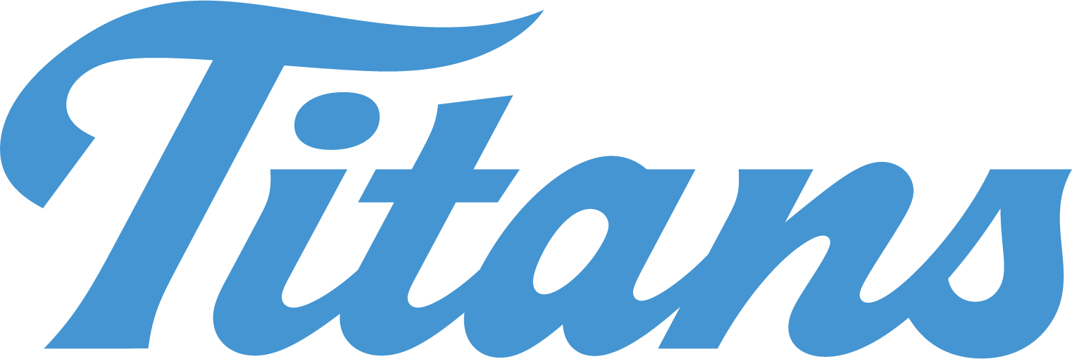
There are a couple of new wordmark variations, the primary version of which is the all-white “Tennessee Titans” with the words stacked on top of each other. The secondary wordmark is a trendy cursive and italics “Titans”, and there’s a “Dropshadow Wordmark” that further emphasizes the increased use of red in this new look.
The Titans’ new uniforms
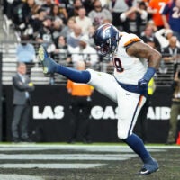
Now for the real fun part: the uniforms. We knew a variety of key details from leaks and reports heading into this reveal, but there’s nothing quite like seeing it all come together. Erin Swartz, Titans Senior Vice President of Brand Marketing, explained the general process they took to get a look that reflected what the people wanted, which involved simplifying some things:
“One of the things we heard loud and clear is that they were looking for this sort of classic athletic look. And when you think about some of your favorite classic, iconic, timeless sports brands, a thing you might notice is that most of those brands have 2 or 3 colors at most in their palate. We had six. And what happens when you have 6 colors is that you have to find ways to integrate all those colors into both the logo and the uniform, and you can get quite a dense or intricate or even busy piece by doing that.”
Swartz went on to explain the heavy emphasis of “Titans Blue” as their new primary color. “We know that on any given Sunday, about 25% of NFL teams can show up in either a navy or dark blue color,” Swartz told local media. “But we’re the only team in the NFL that has this particular shade of blue. And so by leaning into this, we could find a space within the NFL that was really unique. And really give our fans a unique color that they could stand by, really boldly, and support their team, whether they’re cheering for us in an away stadium or here at home. So it was about creating that unique moment that only we can own. But as Burke said, we knew we wanted to make that, really, of Tennessee and of Nashville.”
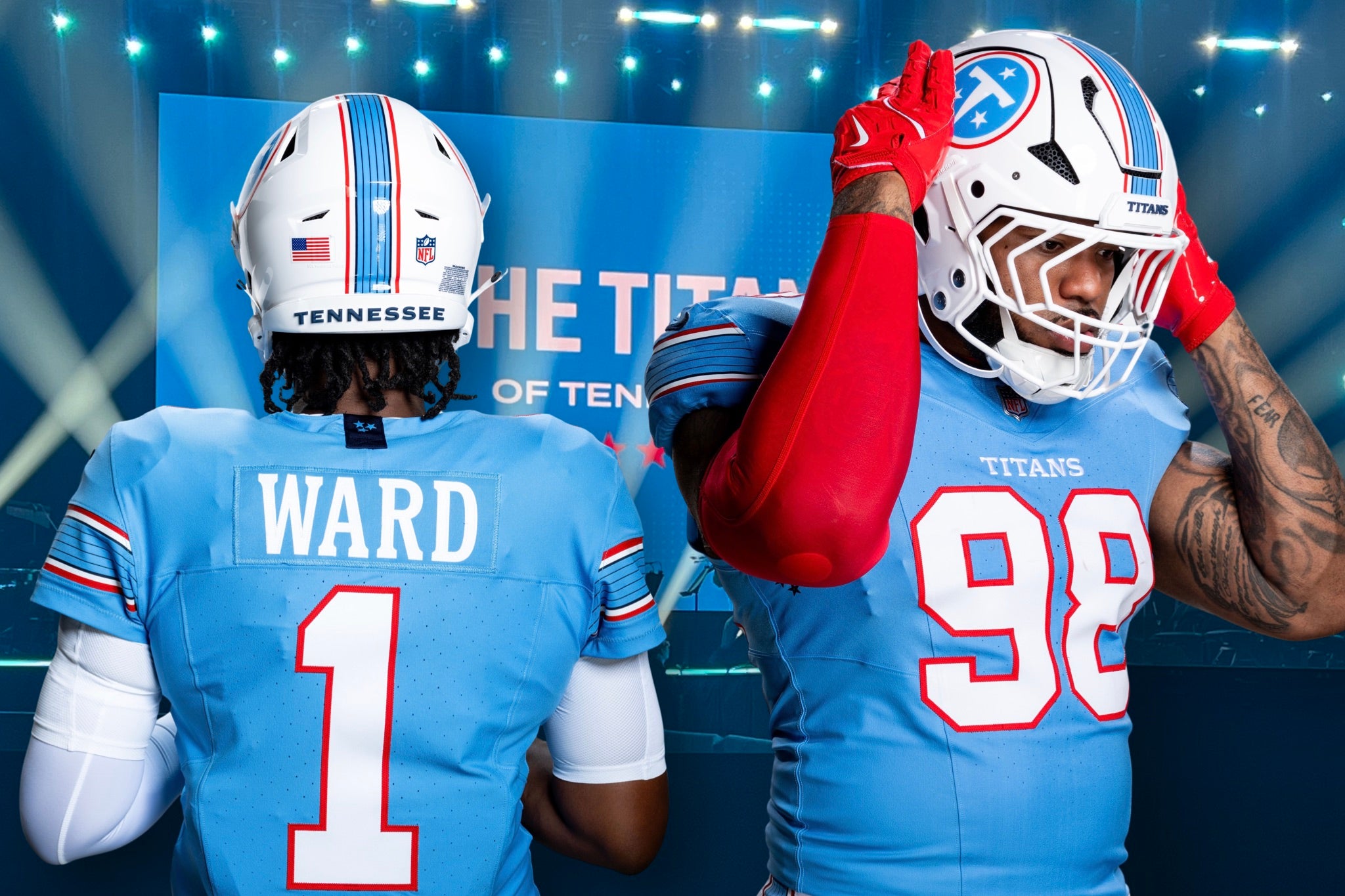
The first element that stood out to me on first glance is the use of stripes. The thick, primarily “Titans Blue” stripe down the center of the helmet is the same as the one on the sleeves and down the leg of the pants. Once you see the thin navy striations within the stripe, it’s impossible to miss what they were going for. “We’re calling that the six-string stripe,” Swartz said of the guitar-inspired feature. “We took what is a really traditional football element, a sleeve stripe, and we gave it some, I think, subtle but unique character that makes it specifically of Tennessee and of Nashville here.”
The helmet is white with a white facemask, as previously reported by A to Z Sports. The primary wordmark on the breastplate of the jersey is the one fact we had an incomplete picture of in our reporting, as we reported that it was “Tennessee”. This is true of the white away jerseys, but the blue home jerseys are sticking with “Titans”. Swartz and Titans President and CEO Burke Nihill explained how this difference was intentional, emphasizing how they are the Titans when at home but are always representing the state of Tennessee when they’re away.
“The Tennessee Titans word mark, the new Titans word mark, we drew from the original angles and shapes of the original logo,” Swartz told us. “But we made it bolder and thicker, stronger. We were inspired by Tennessee letterpress, or poster print, that has been made famous here in Nashville.”
The jersey numbers are the original Oilers numbers, thick and easy to identify from afar. The classic thin red outline is a welcome element of the increased use of red in this uniform. The navy tristar teased around town in the Titans’ billboard and social media campaign ahead of this event is in two places: on the exterior tag on the collar, and under each arm hold along the sides of the jersey.
New Titans merch can be found online as early as tonight.
Tennessee Titans News
Grading The Signings: Evaluating contracts the Titans handed out on chaotic Day 1 of free agency
Instant grades for each of the new Titans players added by GM Mike Borgonzi on Monday.


