Titans Rebrand Reactions: NFL world doesn’t hold back on mixed reviews of new logo and jersey redesign details
Here’s what the internet had to say about the Titans’ upcoming logo and jersey overhaul.

The hottest Tennessee Titans topic of the offseason so far has been the hiring of new head coach Robert Saleh. A close second? Their brand overhaul that’s going to be unveiled this spring.
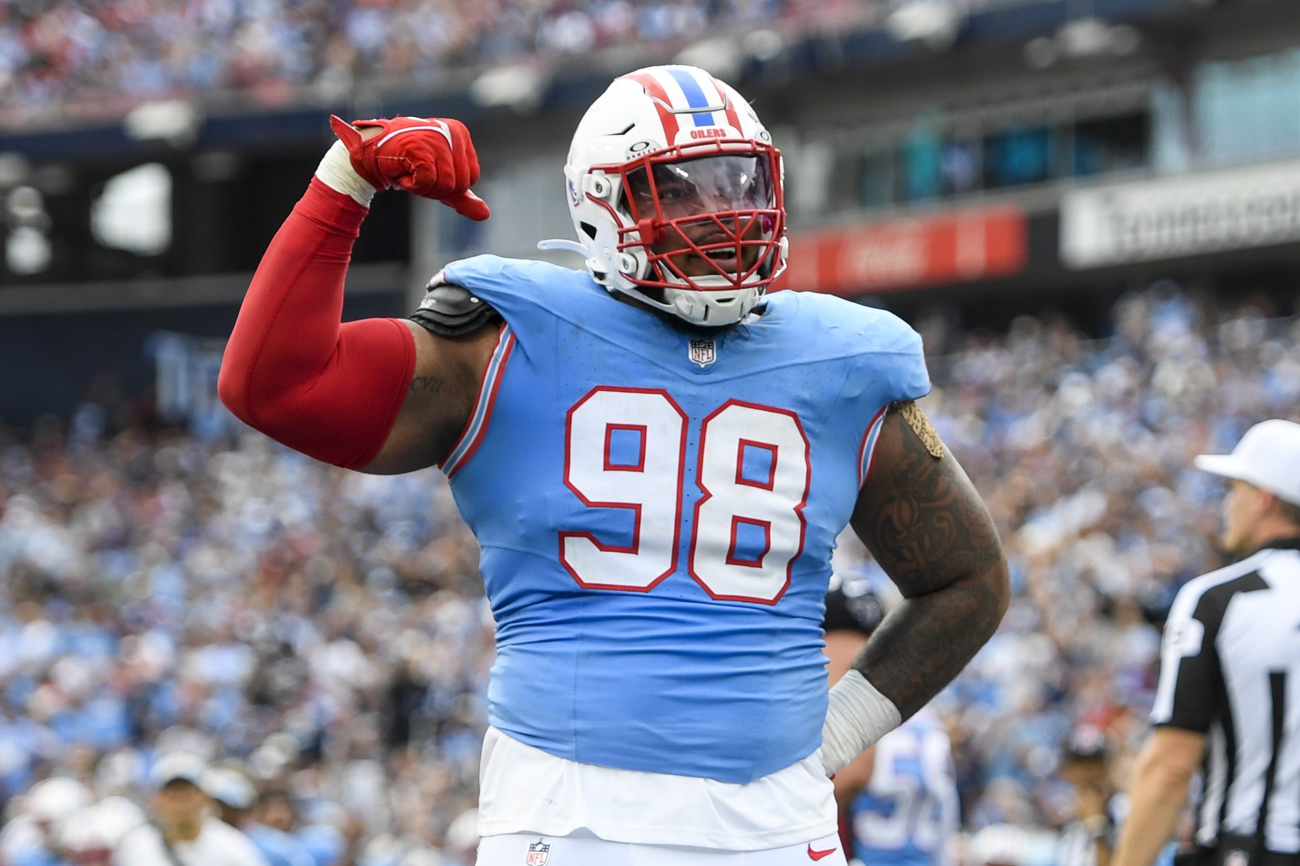
In case you’ve missed it, the Titans are getting a whole new look this year. Their logo and jerseys are changing, and details including our first look at the new logo can be found in my initial report right here.
NFL fans all around the world reacted to this first look over the weekend, and naturally, everybody got their takes off on social media. Here’s what people were saying, including my two cents.
New Titans logo draws mixed reviews
Let us begin with easily the most important angle of this story. Robert Saleh just finished compiling an impressive crew of nine bald coaching staff members, setting the tone for how things are going to change around here. Bald is beautiful, bald is in. So the new Titans logo is following suit by losing it’s mane of flames.
Depending on the people your social media algorithm decided to fill your feed with, you may have seen extreme criticism of the logo…
… or strong praise for it.
Social media covered the full spectrum. One observation that cannot be disputed is that the change mirrors the modern trend in branding to hyper-simplify and minimalize everything.
One of the more interesting critiques I saw was that in removing the flames from the logo and moving away from mythological imagery, the Titans were divorcing themselves from everything that makes their namesake make any sense.
While I understand the brand package seems to be headed for a world with much less direct Greek iconography, and that’s a bummer to many, being located in Nashville is still what makes the Titans’ name make sense. I wrote about the big thing many are missing when it comes to this change and Nashville’s history right here, I bet you’ll find the specifics interesting.
A downright bizarre part of the initial reaction was the mourning of the flaming thumbtack logo on a national level.
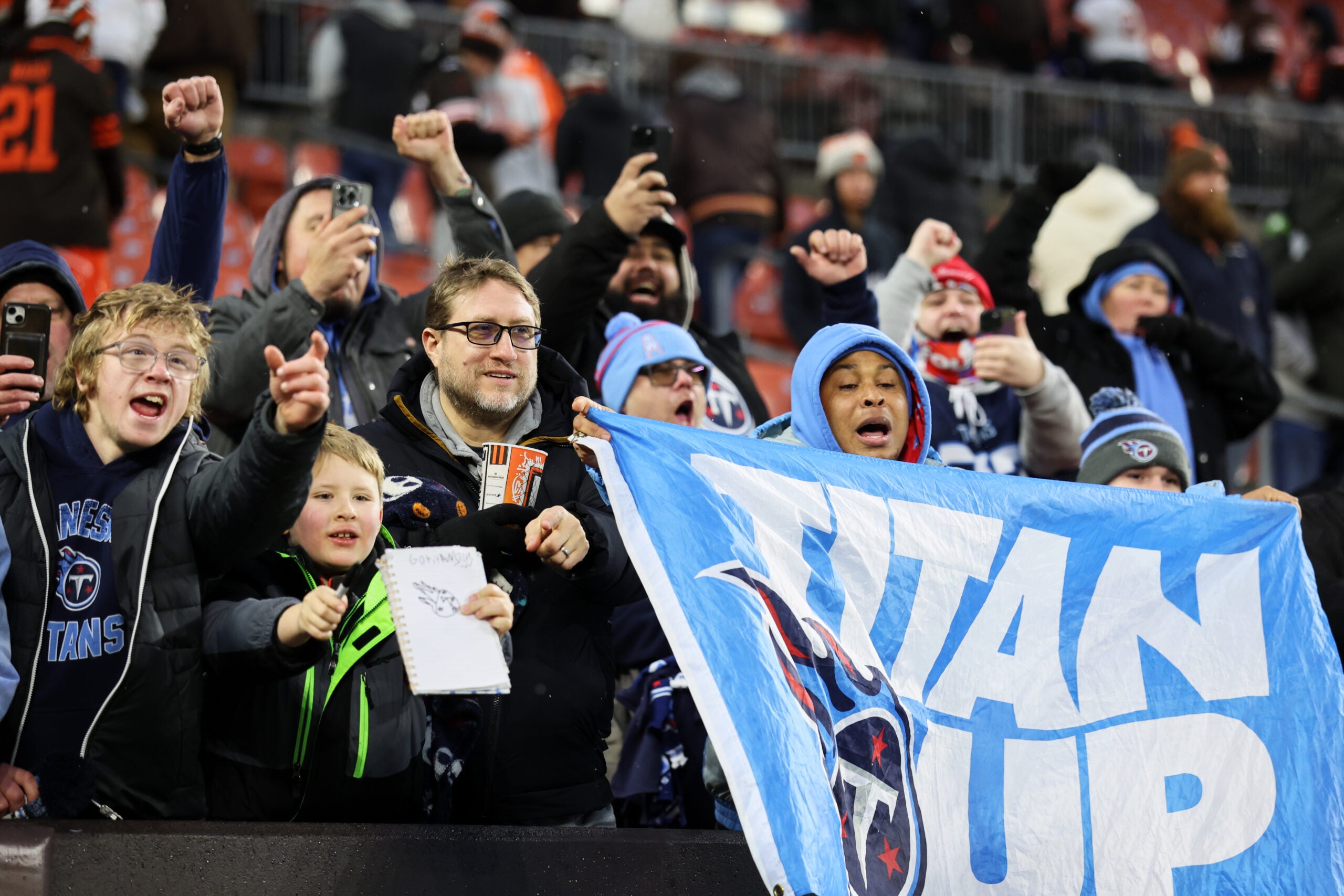
If a vocal portion of NFL fans outside of the Titans fanbase lament the loss of the old logo, claiming it was some gem they will miss, nobody who follows the Titans is going to understand it. That’s some incredible gaslighting. I’m not calling out any one person in particular for retconning history, there are plenty of folks who have always liked the original Titans logo. But in general, it’s been mocked as one of the worst in the league for as long as I can remember.
Change makes people act funny sometimes.
The reaction wasn’t all bad by any means. Plenty of folks liked what they were seeing.
It was especially popular when artists started mocking it onto helmets and uniform concepts.
This is essentially my take on it as well. The logo on it’s own is going to take some getting used to for most people. I definitely think it will look and feel better when it’s presented in a pleasing way by the designers of the brand ecosystem, not in a low-quality retail picture of a dark brown furry football. Environment matters. Even then, it’s going to garner mixed reviews at first.
But once the uniforms and helmets are unveiled and shown off—I’m assuming by the likes of Cam Ward, Jeffery Simmons and others like the last Titans unveiling did with current stars—I think people are going to love them. I think this logo and the full rebrand is going to be much more palatable to the majority of fans when you see it as a part of the full look. It shouldn’t be too much longer until we get to…
Tennessee Titans News
Sources confirm new Titans logo plus elements of new uniforms, branding redesign for 2026 NFL season
The Tennessee Titans are officially moving off the original ‘flaming thumbtack’ logo as part of a full rebrand with new jerseys coming for the 2026 NFL season

NFL
One of the biggest Titans rebrand changes has NFL fans missing the point on why the team is called the Titans in the first place
No, the Titans shouldn’t consider changing their name.


